Recent Work / Made Market Branding + Website
It's time to share some new work!
Made Market is a curated, handmade market located in Louiseville. It offers local vendors the chance to sell their handmade goods to the community and gives buyers the opportunity to shop the highest-quality goods.
Al + Jordan, owners of Made Market, were getting ready to expand it. They knew that professional branding would help take their business to the next level and keep it cohesive as it expanded. I was more than happy to jump in and help bring their vision to life.
Project Overview
Who
Made Market
What
A Curated, Handmade Market
Where
Louiseville, KY (with new locations coming soon)
Brand Qualities
Modern, Trendy, Handmade, Welcoming, Community-focused
Services provided
Branding + Web Design
Brand Mood
We wanted a trendy, modern feel to appeal to the type of clients that Made Market attracts. We initially considered using hand-lettering and including some hand-drawn elements, but also wanted to explore clean type-faces. We knew we wanted the color palette to be primarily black and white. Since Made Market offers a wide variety of products by various vendors, it was important to keep the overall branding clean and neutral. We toyed with the idea of using a pop of green in the color palette, but ultimately it was better to keep it simple, so that it didn't clash with the products being sold or the vendors' branding.
The Logo
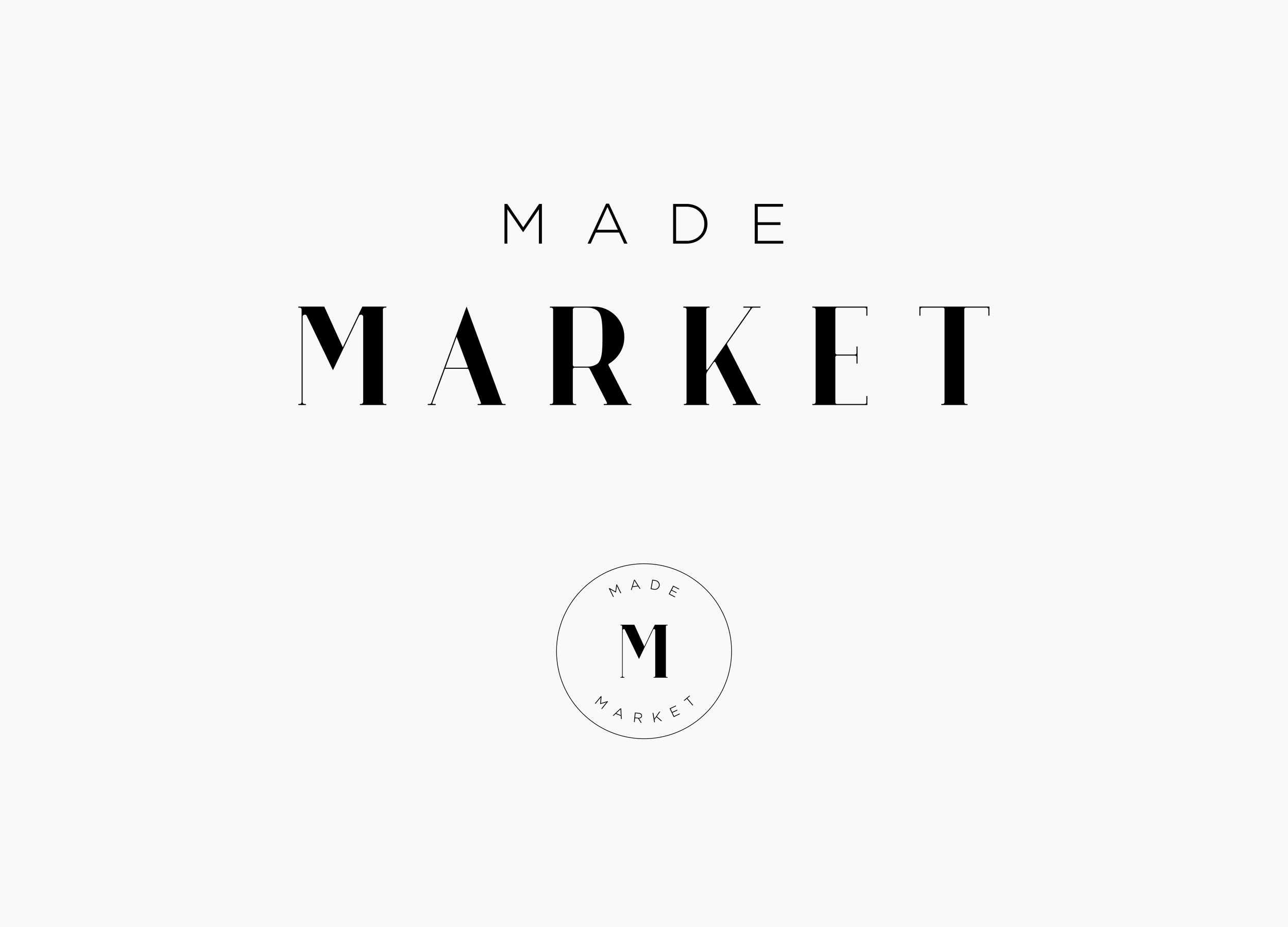
For the final logo and submark, we decided to forego the hand-lettering in favor of something more clean and modern. This definitely creates the on-trend feeling that we wanted for the brand. The submark adds some personality, while remaining clean and simple.
The Website
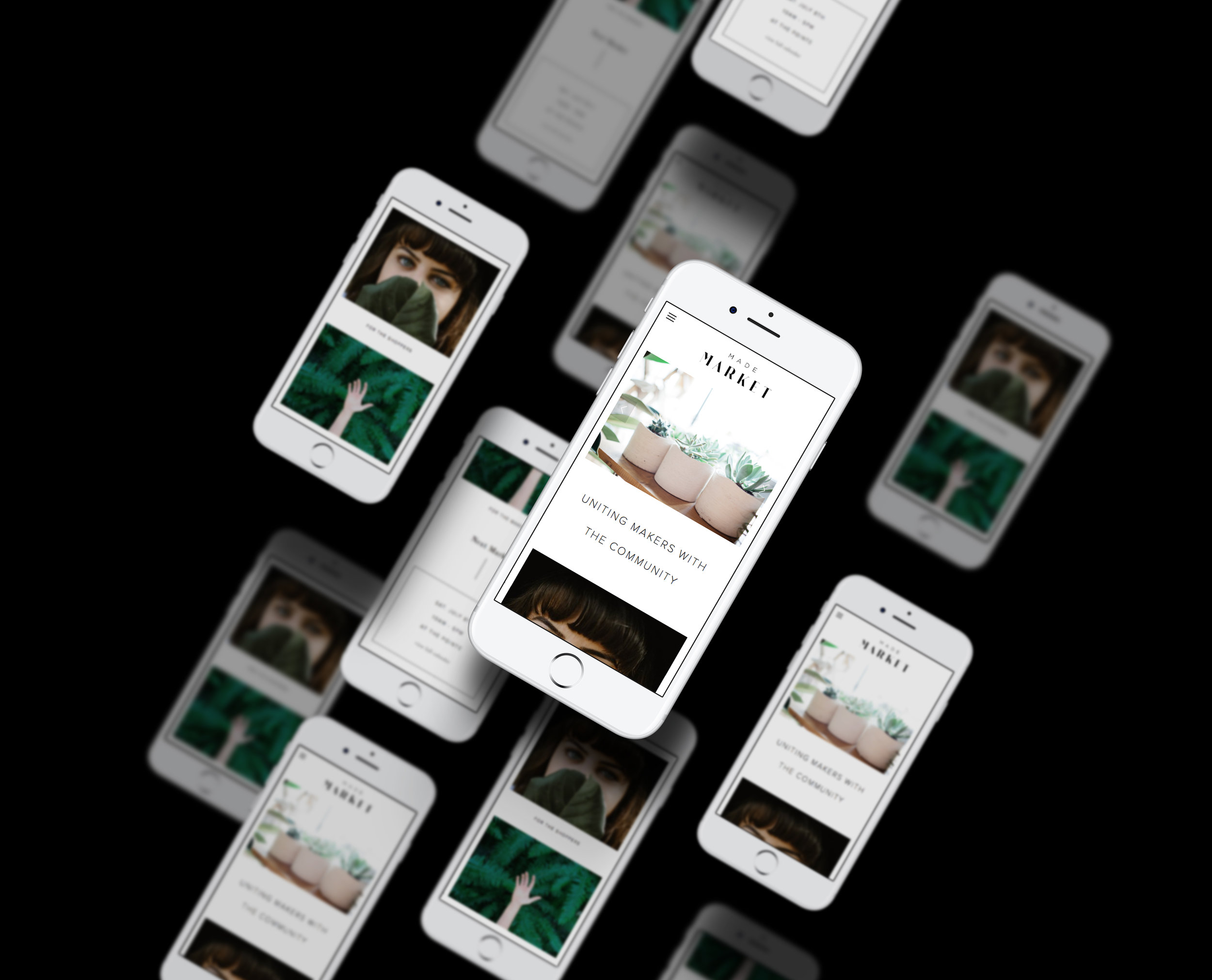
The website is clean, simple, and easy to navigate, but still has some unique details. We used simple line elements to add interest in a modern way. In the rotating slider on the homepage, photos of the products and the market itself add personality and color. All of the important information, like what Made Market is, who they cater to, and when and where you can find them is clear up front. The website also translates well on mobile, which is always a must.
I LOVED working on this project and am happy to finally be sharing it. Next I'll be sharing the branding and website I designed for their sister brand, Made Weddings. Stay tuned!


