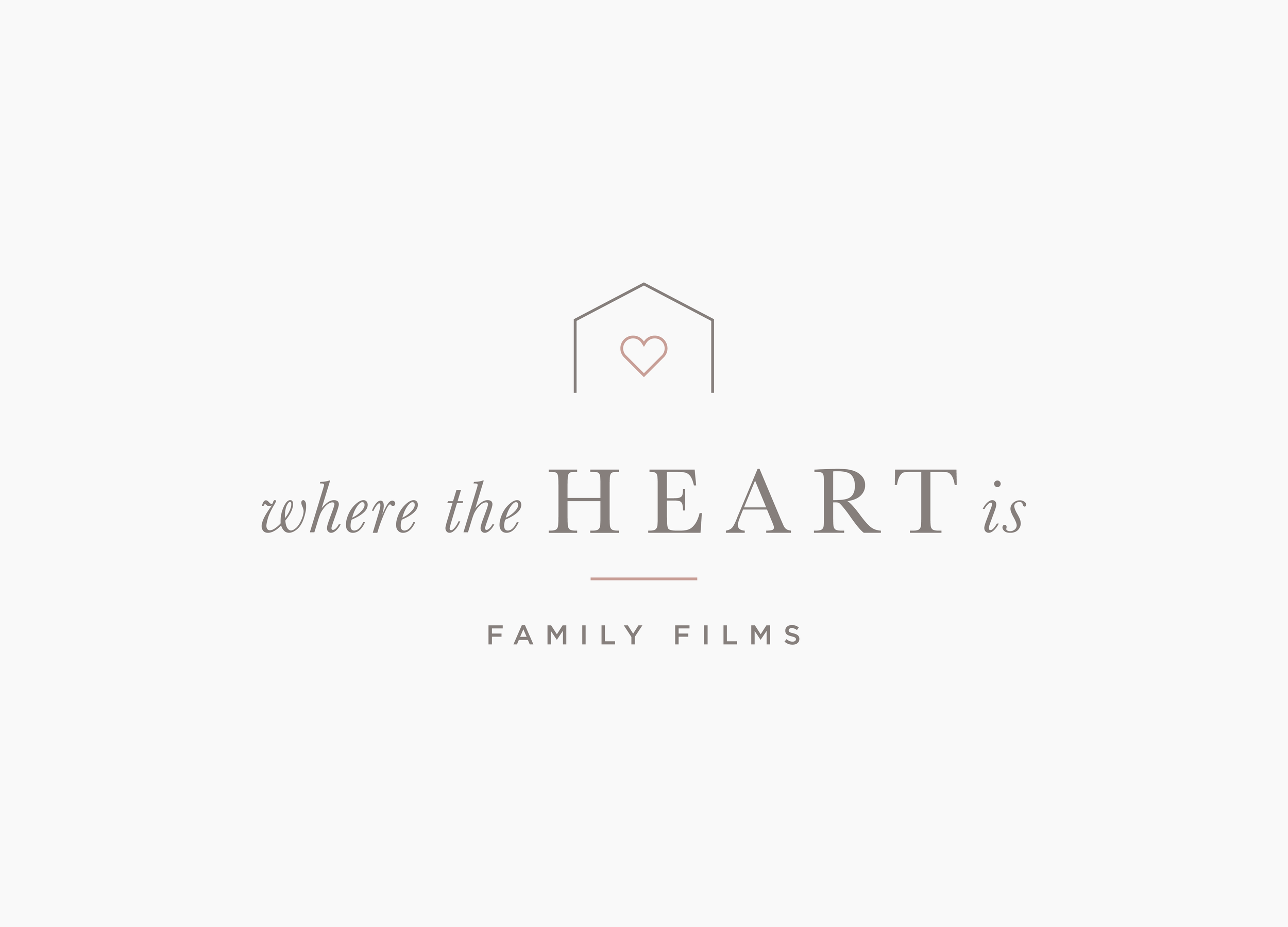
Before + After / Where the Heart is Logo
It's fun to share final logos, but it's even better when I have a "before" logo to share alongside the final one to show the transformation that took place. As the name suggests, this logo is for videographer who specializes in family films. Audrey, the owner, was ready to look more professional and wanted a logo that communicated that.
The Logo Before
As part of the design process I ask clients to give me a few words that describe their brand style, as well as a more in-depth explanation of how they would like their business to be perceived. These are the answers I received from Audrey:
Brand Qualities: Relaxed, Playful, Romantic, Moody (lighting-wise), Nostalgic
“I want my business to be perceived as a solid investment, one that you can't go wrong with. I put a lot of thought and effort into each film to make sure my clients love the end product. I want to attract clients who are relaxed with play time, and who also love to love up on their kids.”
The original logo didn’treflect the solid investment that Audrey’s films truly are.
The Logo after
Below is the mood board of inspiration that we used to guide the design process. It’s one of my all time favorites. It’s so cohesive and came together pretty effortlessly. The moody lighting, feminine color palette, and classic typography all work together so beautifully.
To improve Audrey's logo I chose fonts that paired well together and looked more polished. The serif font says timeless with an air of nostalgia. The sans serif and clean lines keep it current and relaxed. The color palette is soft and romantic, and the muted tones have a moody air. The overall result is professional, yet still soft and relaxed.
The Feedback
Here’s what Audrey had to say about her experience working with me:
“Megan worked with me to create a logo for my growing family film business. Even though I only did a logo and not a full brand, I feel like she treated it like so. The questionnaire dove deep into my brand and my ideal client and really helped me consider things about my business that I hadn't before. The options she sent me were all the look I was going for and was a hard decision to choose between them.
Ultimately, I have a logo that I love and the process was really fun, I always got excited when I saw an email in my inbox from Letterform Creative! I'd definitely recommend her to help you grow your brand!”
The Quick Logo Test
Wondering if your own logo needs a refresh? Here’s a quick little test you can take to find out.
List 3 adjectives that describe how you’d like your business to be perceived. (Examples: sophisticated, approachable, professional, playful, etc.)
Show your logo to someone and ask them for three words to describe it. You can do this by posting your logo in a Facebook group, asking a friend, or email it to me and I’ll tell you what I think!
Does your list line up with the feedback you received? If not you know it’s time for a logo refresh.
Hopefully this before and after example gives you an idea of what’s possible with professional help. I also hope this little logo test has given you some insight into how well your logo is working for you. Please take me up on the offer to give you some quick feedback! I LOVE hearing from you and am always willing to give away some free help whenever I can.
Do you already have a logo you love, but need to complete the rest of your branding? If so, download my FREE Simple Branding Checklist to walk you through everything else you need.


